Guiding first time users down the conversion funnel – from trial towards subscription – by enabling new ways to discover, achieve, and celebrate site building milestones.
Role
Product Designer
Timeline
Jan - July 2019
Context
In Q1 of 2019, Squarespace doubled down on its growth efforts, making large bets on optimizing the user onboarding and trial experience.
Key Result
KR1: Increase the # of website trials by 10%.
KR2: Increase site conversion (subscriptions) by 5%.
In August, we met with 10 NYC-based Squarespace trialers in order to map out their journey in trying out Squarespace and discover any gaps between our assumptions and their experiences.
Target Audience: Med - Low Intent Trialers
Trialers converted when they were confident they could use Squarespace to enable a significant pivot in their lives.
Highest-intent trialers often subscribed upfront as a personal commitment to their lifestyle pivot.
Medium and low intent trailers needed confirmation that Squarespace could enable them to successfully perform key actions that mattered to them, without too much pain.
The Problem
Trialers encountered a fairly consistent path of demoralizing obstacles re. template selection and customization. For medium and lower intent trial users, this affects conversion.
Research Takeaways
Template selection is exciting, but trialers wondered how much they’d need to rework templates to match their personal goals.
Tinkering with colors and fonts is a very common initial activity, but the Style Editor/content dichotomy demoralized them.
Trialers often know how they want to be perceived, but can rarely articulate the visuals needed to get there.
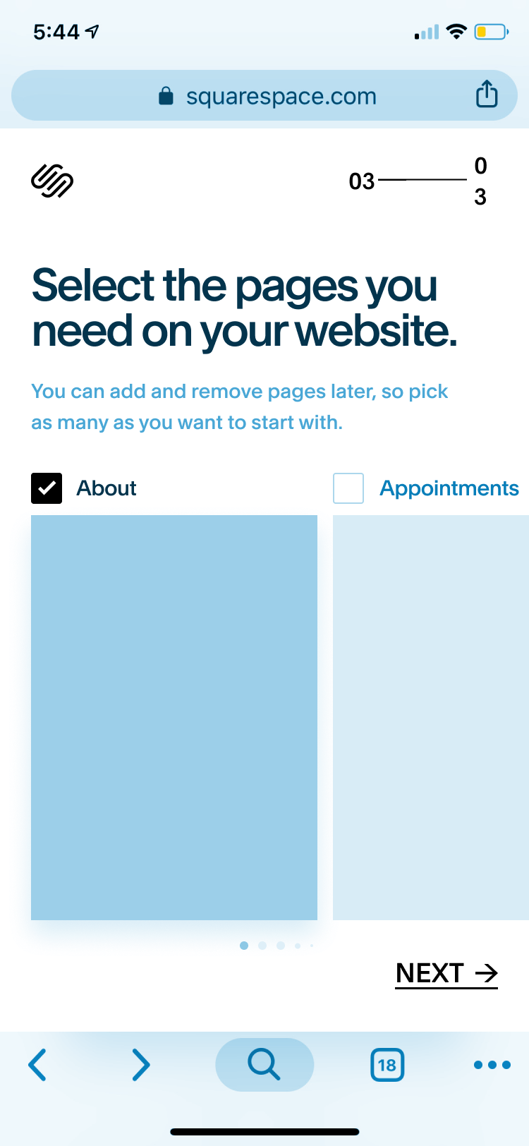
Many trialers expressed uncertainty with the pages panel, and very few appeared to understand how to use this core UX element after as much as 10 days of their trial period.
Hypothesis
If we can help trialers better achieve and celebrate small wins, users may feel better equipped to realize significant pivots in their lives—ultimately driving conversion.
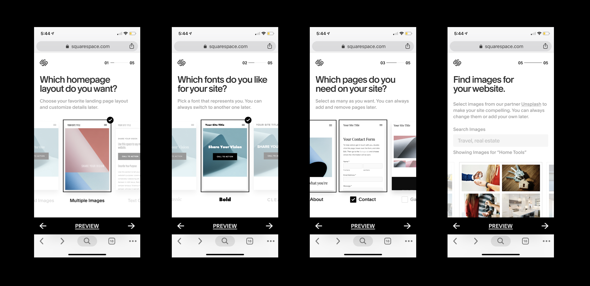
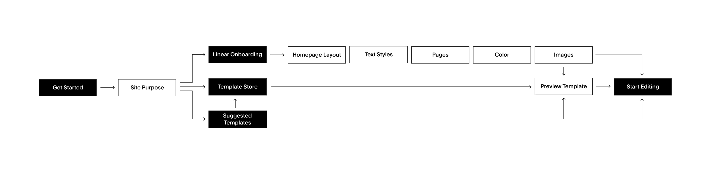
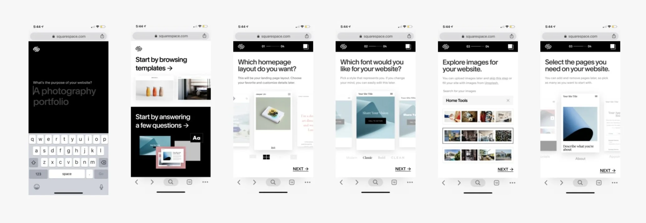
Linear Onboarding Scope
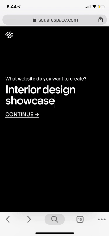
Site Intent
Better understand user by intent, identify conversion trends, and offer personalized recs.
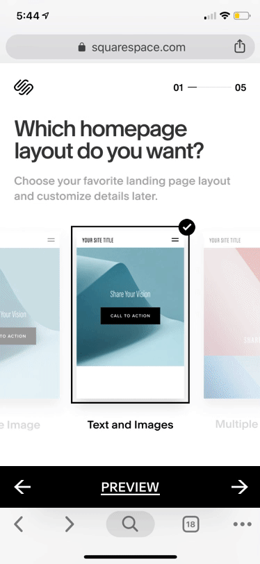
Homepage Selection
Offer flexible landing pages that meet needs of the Hustler, Explorer, Visionary personas.
Font Selection
Consulted our web design team on modern, usable, and comprehensive typography styles.
Add-on Pages Selection
Based on V7 templates, surface popular pages, ranked by relevancy to site intent.
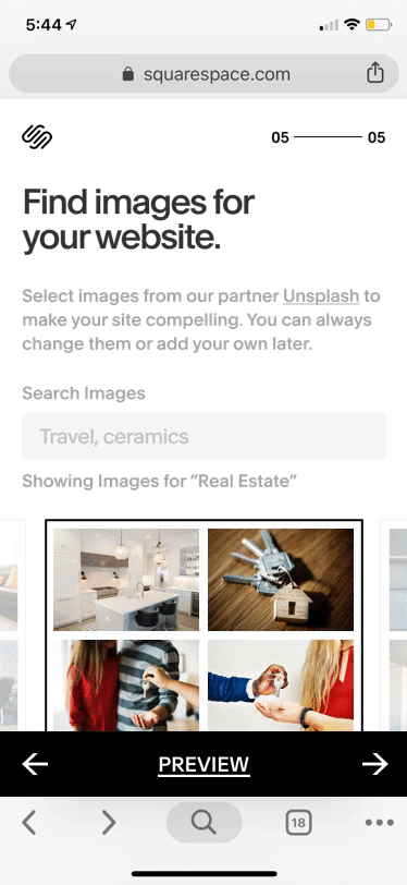
Image Selection/Editing
Partnered with Unsplash to help users articulate the visuals they need to communicate their vision.
From a Qualaroo survey, we learned that 36% of visitors cited a desire to build a site from their phones. Following an initial experiment on desktop, we set out to build an ambitious site building and previewing experience for mobile web, the first of its kind.
User Flow
Experience Goals
Inspiring
Personalized
Committed
Self-Actualizing
Interaction Design Challenges
Reconciling Multi and Single Selects
Previewing Website Paradigm
Step Navigation vs Option Navigation
Aligning Expectations re. Customization
Wireframes
Establishing core interaction paradigms & shopping around the user flows on a conceptual level.
Carousel Options, Tap to Select ✔
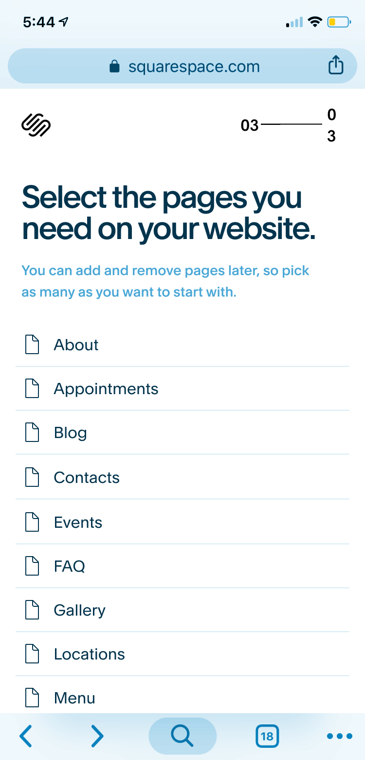
List View Multi-Select Add-On Pages ✗
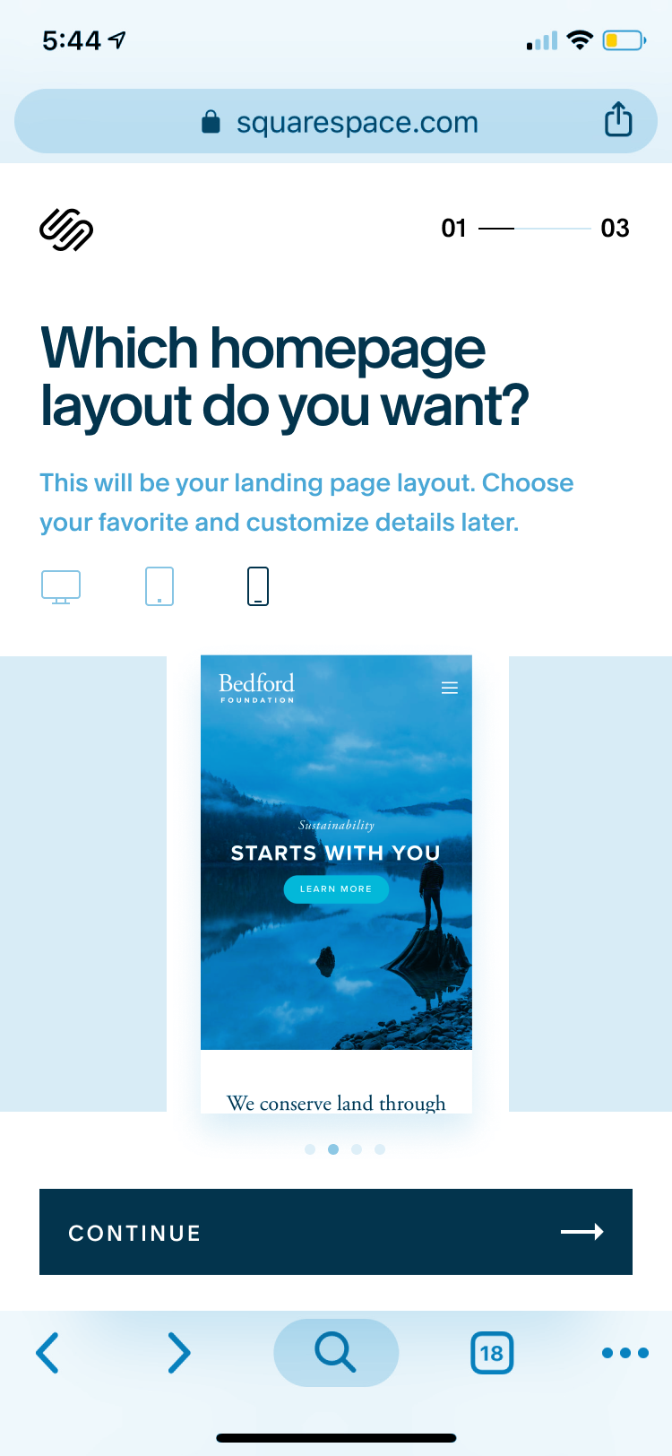
Mobile/Tablet specific viewport thumbnails ✔

Tap Thumbnail for entry point to Preview Mode ✔
First Round Review - Product Team
Agreed upon several discussions on feasibility, time and engineering constraints.
First Round Review - Design Leadership
Reviewing components with the Director of Product Design, UX Writing Manager, and Core Components Lead.
Iterative User Tests
Usability testing Figma prototypes with employees who did not work on product to receive quick and dirty feedback.

Users preferring customization leaned towards the template store
There is a strong correlation between users who chose to browse the template store (rather than linear onboarding) and overall curiosity in where colors, images, and fonts were mapped to precisely.
Users expressed hesitation in selecting image packs due some fear of commitment.
People wondered where their images would go since they selected multiple pages, if image packs were an all or nothing type deal. Most people were inclined to skip this step due to the ambiguity.
Colors palettes and light/dark theme mapping needed more work.
Most didn’t know what light/dark modes meant for their site when they toggled back and forth, though everyone worked through it when prompted to. Most would have probably not figured this out in a more realistic setting.
Entry Points
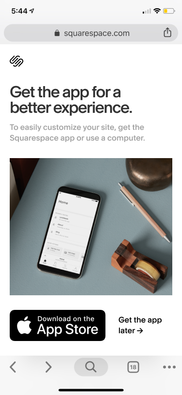
Users can enter the linear onboarding experience through any of the “Get Started” buttons on squarespace.com.

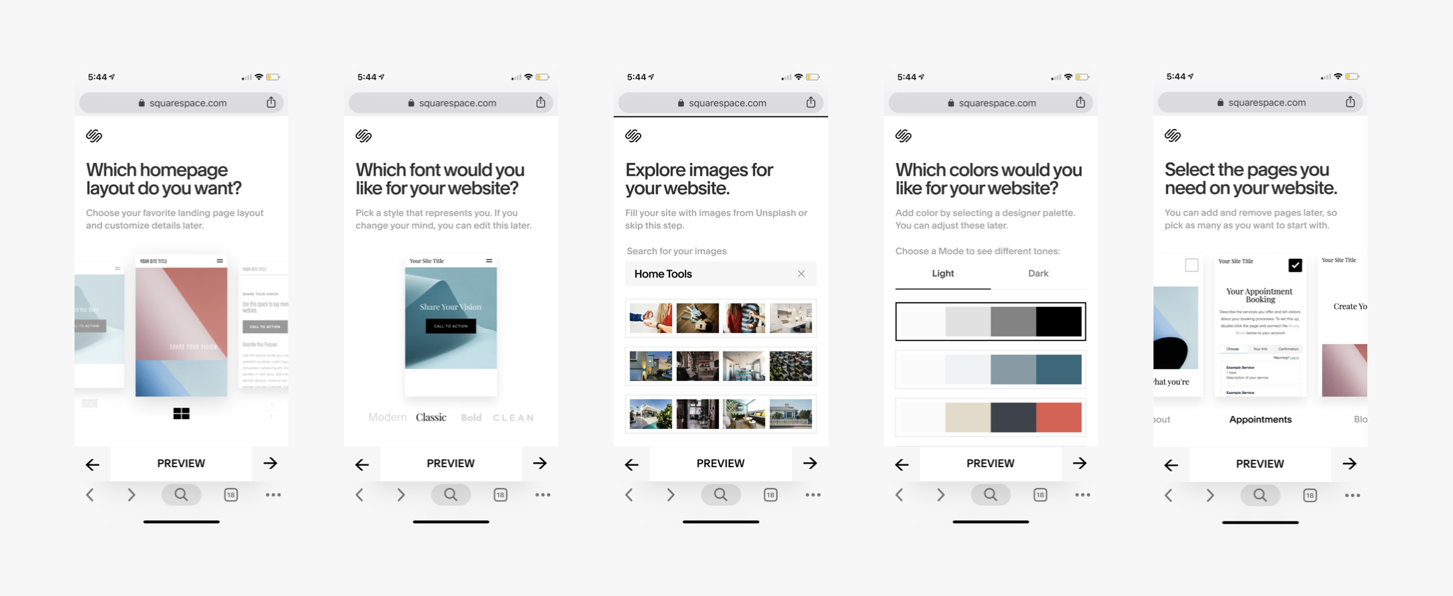
Selections vs. Previews
Preview modes are easy to access at every step of the selection process.
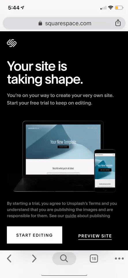
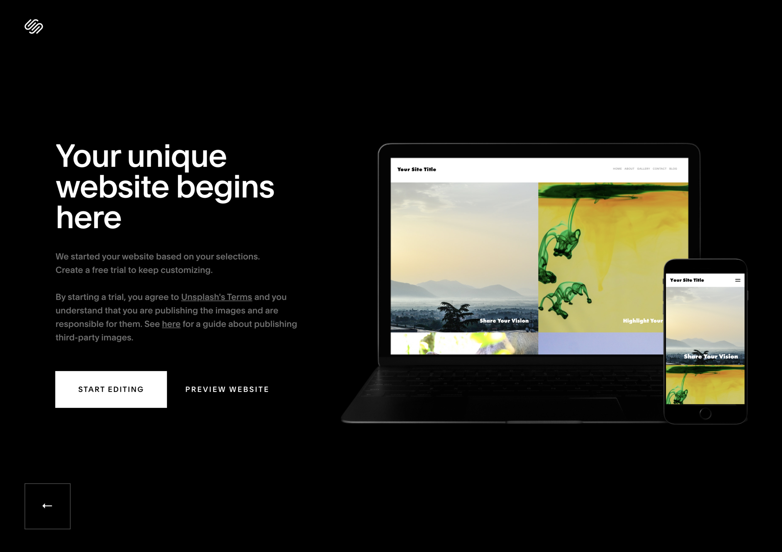
Final Preview
Full site preview based on initial selections, plus a handoff to our native apps.